KronoGraph
The timeline visualization SDK for investigating event data at scale
KronoGraph is a timeline visualization SDK for building interactive, customizable timelines in your applications.
It helps users uncover patterns and explain the story of their time-based data, seeing how events connect and unfold.
Explore our SDK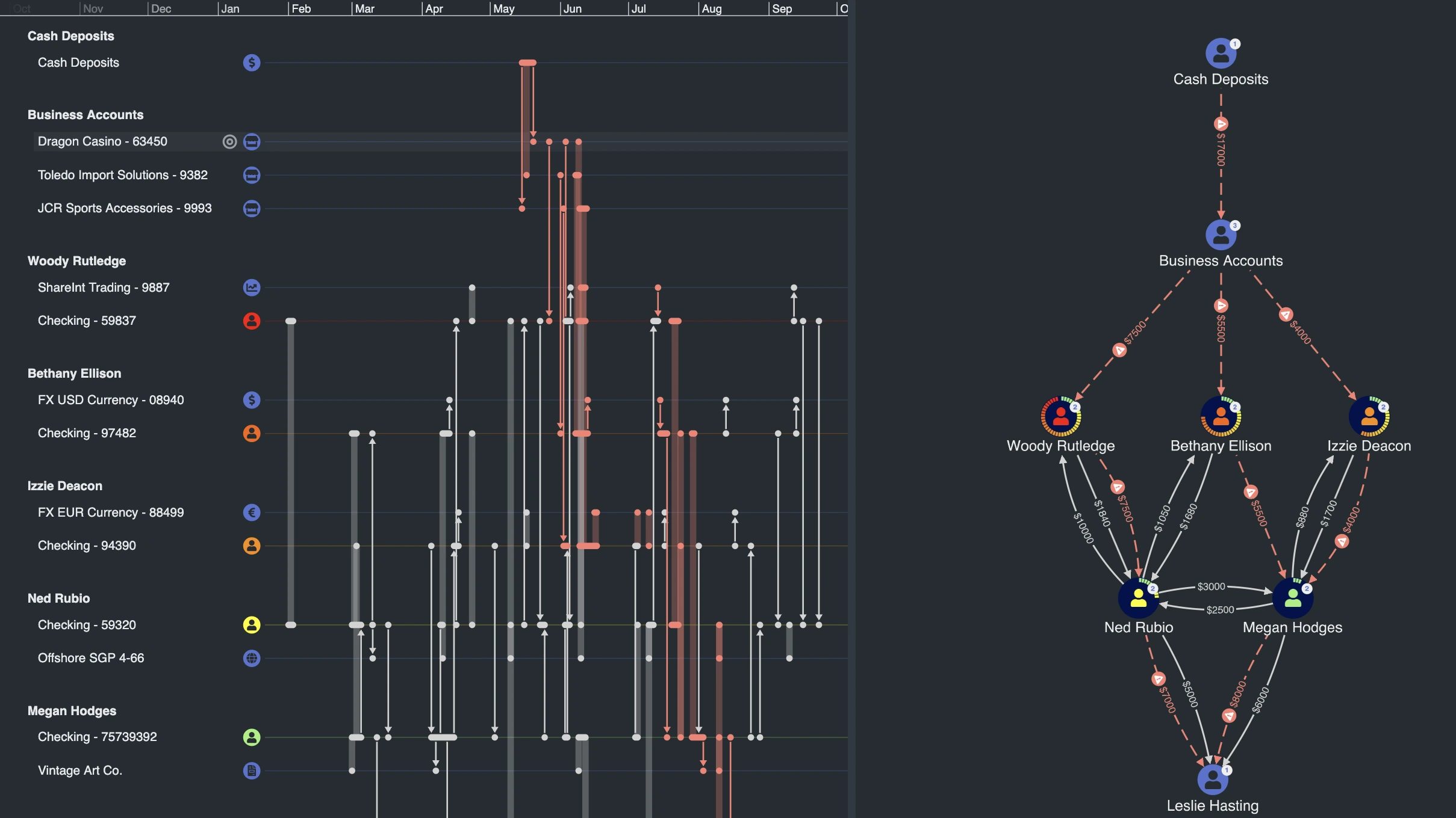
Trusted by leading organizations worldwide
Our visualization SDKs are trusted by leading organizations to investigate cyber threats, detect fraud, and gain intelligence insights. Many extend their analysis with KronoGraph timelines, adding a time dimension alongside networks and locations.
Meet our customers


Logos represent organizations using Cambridge Intelligence products
What is KronoGraph?
KronoGraph is a JavaScript and React SDK for timeline visualization.
It lets you build fully interactive, customizable timelines that scale from a handful of events to hundreds of thousands. What’s unique about KronoGraph is its ability to visualize entities in parallel to events, helping users spot how activities, anomalies, and connections unfold over time.
Use it as a standalone toolkit or combine it with our graph SDKs (KeyLines or ReGraph) and our geospatial SDK (MapWeave) to create multi-dimensional visualizations that connect relationships, locations, and timelines.
Download the KronoGraph white paper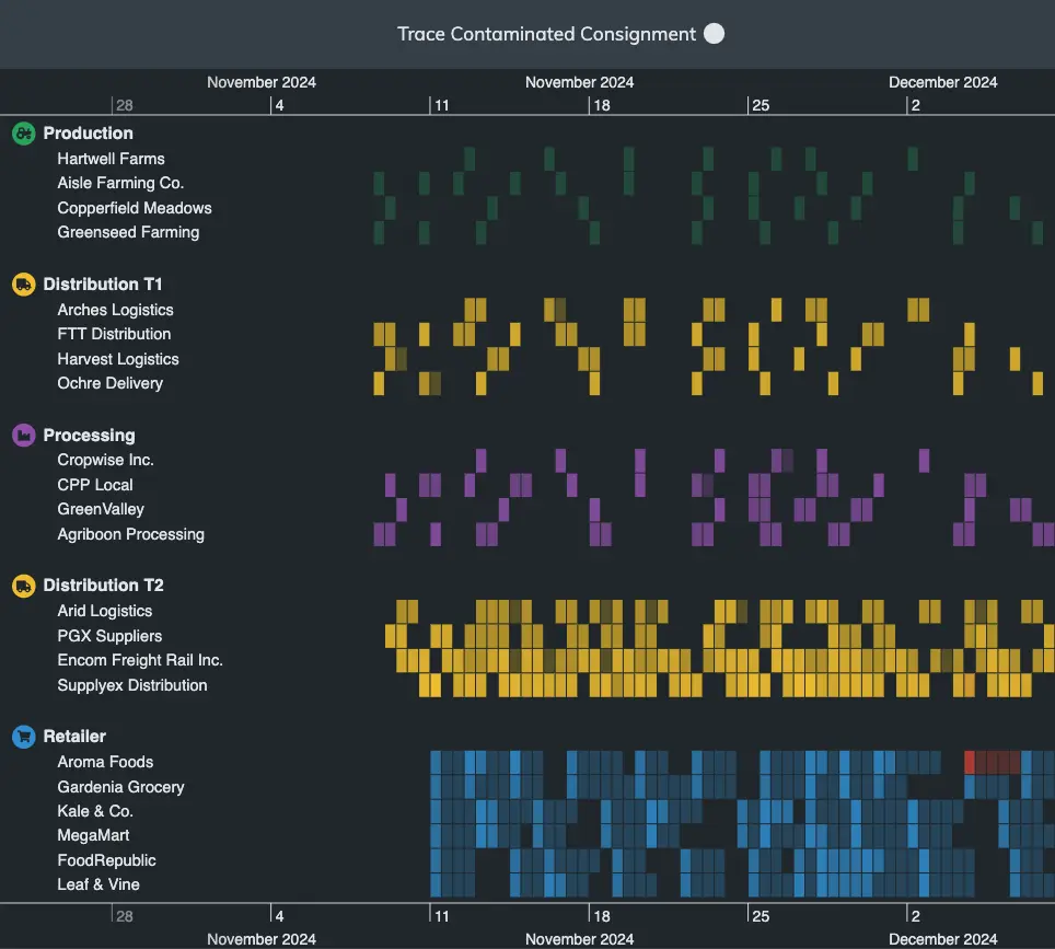
Why teams choose KronoGraph
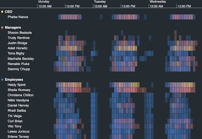
Scale to hundreds of thousands of events and entities
See the big picture and the smallest detail, without losing performance.
KronoGraph aggregates large event sets into clear high-level summaries, then lets users zoom smoothly into individual records. Whether it’s a handful of phone calls or enterprise-wide network traffic, investigations stay fast, interactive, and precise.
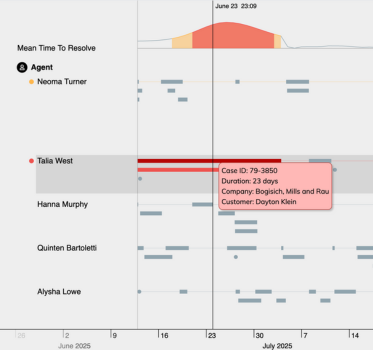
Pinpoint the moments that matter
Hone in on critical events without losing the wider context.
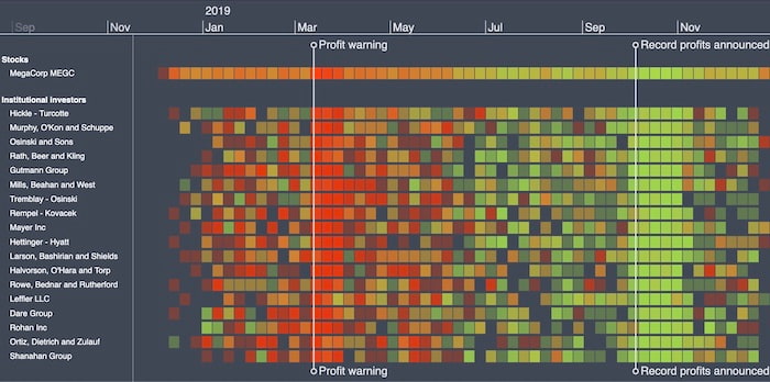
KronoGraph’s Reveal, Ping and heatmap color prioritization let you scroll smoothly through sequences, uncover anomalies, and zoom into the precise events or entities that reveal hidden patterns in your data.
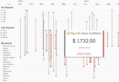
Tell explainable data stories
Add context to timelines so patterns are easy to share and understand.
Annotations turn raw sequences into clear narratives. Analysts can add notes during their workflow, or applications can generate them automatically from the data. The result is collaborative, explainable insights that support faster, smarter decisions.
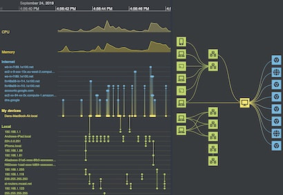
Integrates with any data source
Add timeline visualization to your existing tech stack with ease.
KronoGraph runs in any browser, on any device, and connects to any server or database.
With tutorials, demos, and clear API documentation (plus expert developer support), you can explore time-based data in your applications straight away.


Click a logo to find out more
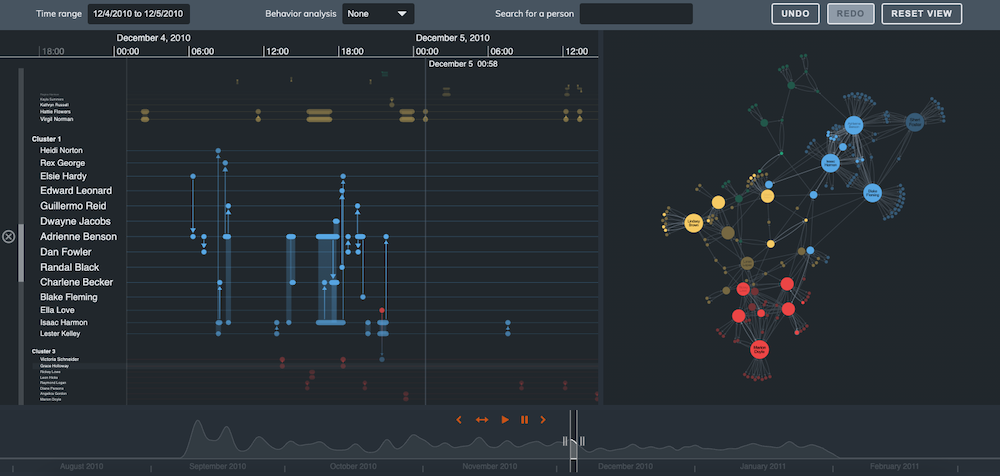
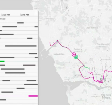
Works with your graph and geospatial visualizations
Use KronoGraph on its own, or combine it with KeyLines, ReGraph or MapWeave for deeper insight.
Easy integration lets you explore graph data in a completely new way, showing how connections and events evolve over time.
With flexible styling and interaction controls, you can build tools that link multiple perspectives into one investigation.

Expert support from your first login
Every Cambridge Intelligence SDK comes with expert support from day one.
From onboarding to launch and beyond, our team is here to help you succeed.
First-line support comes directly from the developers who build our toolkits, backed by experts who can provide health checks, deep-dive workshops, and guidance tailored to KronoGraph.
Try KronoGraph for yourself
Use cases for timeline visualization
KronoGraph brings timeline visualization into your applications, helping analysts see how events unfold, spot anomalies, and explain what happened and when.
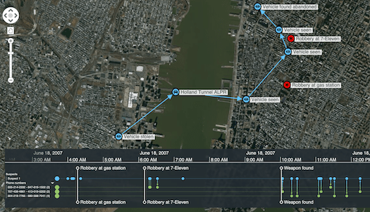
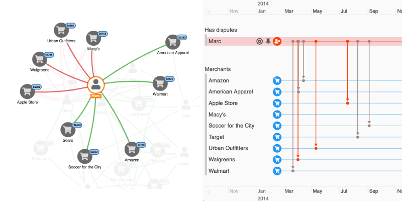
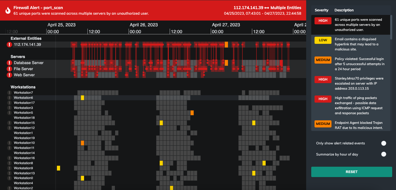
Security & intelligence
Map communications and pattern-of-life information to reveal event sequences
Frequently asked questions about timeline visualization
What is timeline visualization?
Timeline visualization is the graphical display of events in chronological order to show sequence, duration, and timing. Interactive timelines go beyond static charts by letting users drill into periods, compare ranges, and trace how related events connect over time.
How KronoGraph helps: A timeline visualization SDK for building interactive timelines that scale from a few events to hundreds of thousands.
Why is interactive timeline investigation important?
It lets analysts move from a high-level overview to precise moments, filter noise, and spot anomalies as sequences unfold – capabilities that static tables or charts can’t provide. The result is faster investigations, clearer narratives, and more confident decisions.
How KronoGraph helps: Provides zoom, filtering, and interaction patterns designed for investigative workflows.
How does timeline visualization scale to large datasets?
Scalable timelines use techniques like aggregation, level-of-detail rendering, progressive loading and flexible filtering to keep navigation smooth while preserving detail.
How KronoGraph helps: Implements aggregation with smooth zoom into individual events, optimized rendering, and performant data windowing.
Can I combine timeline visualization with graph or geospatial data?
Yes. Timelines pair naturally with graphs (to show who and what is connected) and maps (to show where and when events occurred). Together, these views help explain both relationships and sequences.
How KronoGraph helps: integrates with our graph SDKs (KeyLines, ReGraph) and geospatial SDK (MapWeave) to link networks, locations, and time in a single view.
View all KronoGraph features.
From the blog
Ready to try KronoGraph?
Start building your own timeline visualization app with a free trial.